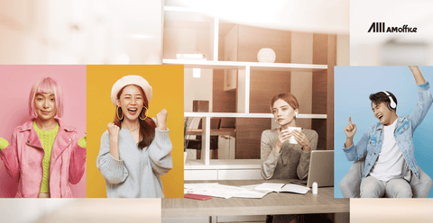
When it comes to creating a productive and motivating workspace, most businesses focus on furniture, layout, or even technology. But one often overlooked element that can dramatically influence how people feel and perform at work is color. This is where office color psychology comes into play — the study of how different colors in workspace design can impact mood, energy, and focus.
If you’re a business owner, HR manager, or office designer in Malaysia looking to boost your team’s productivity, understanding the best colors for office productivity can help create a workplace that supports both mental well-being and performance.
What is Office Color Psychology?
Office color psychology is based on the idea that colors evoke emotional responses, either consciously or subconsciously. The right colors can make employees feel energized, calm, creative, or focused. The wrong colors? They can lead to stress, boredom, or even frustration.
It’s important to note that colors don’t affect everyone the same way — personal experiences and cultural backgrounds also play a role. However, certain color trends in workspace design have been consistently shown to influence mood and behavior across different industries.
Colors That Affect Mood and Productivity in the Office
Blue: Calm but Careful
Blue is often associated with calmness and trust. It’s frequently used in corporate settings to project professionalism. However, overusing blue — especially cooler, muted tones — can actually lead to reduced energy levels and make people feel sluggish or unmotivated.
Pro Tip: Balance blue with warmer accent colors or textures to prevent a space from feeling too cold or sleepy.

Grey & Dark Tones: Risk of Low Energy & Negativity
An office dominated by dark colors or grey tones, especially without natural light, can create a heavy atmosphere. These environments are often linked to higher levels of irritability and stress, potentially making employees feel uninspired or even angry over time.
If your office in Kuala Lumpur has limited access to natural light, it’s crucial to avoid overly dark or grey-heavy designs.
Design Tip: Use grey as a neutral base, but soften it with warm lighting, colorful décor, or plants.
Green: Nature, Balance & Stress Reduction
Green is one of the best colors for office productivity because it’s associated with nature and balance. It has a calming effect while keeping people alert. Studies show that workers in environments with green tones feel less stressed and more satisfied.
Adding indoor plants or using green accent walls can improve focus while maintaining a relaxed atmosphere.
Orange: Energy & Creativity Booster
Orange brings warmth and enthusiasm to a workspace. Offices with subtle orange elements often foster creativity, collaboration, and higher energy levels. However, using too much orange can feel overwhelming.
Design Tip: Use orange in breakout areas, creative rooms, or collaborative spaces where you want ideas to flow freely.

Natural Light: The Ultimate Mood Enhancer
While color in workspace design is essential, natural light plays a huge role in amplifying the effects of your chosen palette. Offices flooded with sunlight tend to have happier, more engaged workers.
Large windows, glass partitions, or even daylight-simulating LED lights can make a significant difference in an urban office setting like Kuala Lumpur.
Frequently Asked Questions (FAQ)
Of course, if you’re just looking for quick answers, all the information above might feel like a lot — especially if you’re not from a design or creative background. To make things easier, we’ve put together some of the most common questions about office color psychology, with clear and straightforward answers.
1. What is the best color for office productivity?
Soft greens, light blues, and warm neutrals are often the best colors for maintaining focus and balance in the office. These colors promote calmness while keeping employees alert and engaged.
2. How does color affect employee mood?
Colors influence emotions by triggering psychological responses. For example, warm colors like orange and yellow can increase energy and creativity, while cooler tones like blue or grey can create a calming — or sometimes dull — effect depending on usage.
3. How do I choose the right color for my office?
Start by identifying your company culture and the purpose of each space. Use energizing colors like orange or yellow in creative areas, calming tones like green in focus zones, and avoid overusing dark or grey tones in spaces with little natural light. For best results, combine your color palette with good lighting and functional design.

Final Thoughts: Color is a Silent Influencer in Workspace Design
Color is more than just decoration — it’s a strategic tool in creating a workspace that motivates and nurtures your team. Whether you’re designing a new office or refreshing an existing space, applying the principles of office color psychology can enhance both mood and productivity.
At AM Office, we understand that color in workspace design isn’t just about style — it’s about creating environments where people thrive. Contact us today to learn how we can help you design a workspace in Kuala Lumpur that reflects your brand culture while supporting your team’s well-being.